We kicked off our week-long celebration of International Women’s Day by taking part in a collaboration with #MakeoverMonday – a weekly social data project that takes place on Twitter, and which unites and challenges data analysts to create vibrant and insightful data visualizations. This week, we presented the community with a data set from The World Bank collection of development indicators, and challenged them to use the data to highlight the inequities in health systems that primarily affect women and girls.
Operation Fistula selected a handful of indicators that we think correlate to the prevalence of obstetric fistula. Obstetric fistula is a condition that tends to occur in places where gender inequality is at its most extreme. Knowing about these related factors, and increasing awareness around them, may reveal new insights and opportunities for us to strengthen our work to end fistula.
We are so excited to see what the #MakeoverMonday community comes up with, and encourage you all to check out the conversation. We’re especially excited because we operate with the fundamental belief that communicating data in an intuitive and compelling way – with human stories at the core – is key to transforming the social impact sector.
Humanizing Data
Data is fundamental to the mission of Operation Fistula. The increased use of data is critical in the development sector. Data allows us to get a comprehensive picture of a problem and develop approaches to solve it. We can use data to recognize risk factors to prevent illness and injustice, or to identify where help is most needed. Data enables us to make decisions based on facts, but does that mean it is devoid of emotion?
Statistics, data, evidence: these words can conjure up images of pie chart PowerPoints, and bar charts in convoluted reports. But even the most insightful analysis is useless if it isn’t communicated effectively to those who have the power to make changes. This is where data visualization comes in. Data visualization makes insights accessible and engaging, and if done right, it can communicate a whole lot more than just raw numbers.
Three Examples of Humanized Data
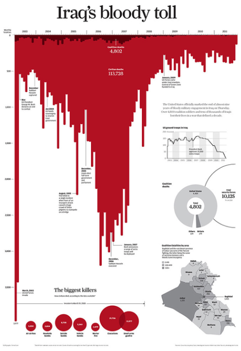
A great example of data with emotion is Simon Scarr’s visualization on the Iraq war. The choice of using an upside down, red bar chart to indicate the number of casualties conjures up images of blood, creating an immediate emotional experience. The prominence of the bar chart, stretching across most of the page, further underlines the large number of victims in this conflict.
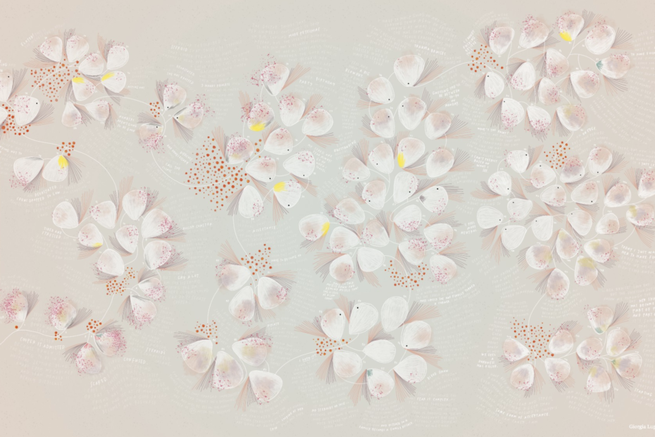
Georgia Lupi’s visualization isn’t immediately recognizable as such. She demonstrates that data does in no way need to be dry or dehumanized and can in fact be deeply emotional and personal. The image shows her friend’s daughter’s journey with Idiopathic Thrombocytopenic Purpura. Each of the petals symbolize one day, with the shading, red speckles, yellow dots, and other aspects encoding information such as the level of bruising, count of platelets or a happy occasion. I highly recommend visiting her page to fully understand the intricacies of how this artwork was designed and the story that led to its creation.

Finally, we have a very simple infographic by Athan Mavrantonis, which was created as part of a previous #MakeoverMonday project. The dataset aims to contextualize data on the world population by presenting it as the number of people that would be in a particular category if the world consisted of only 100 people.
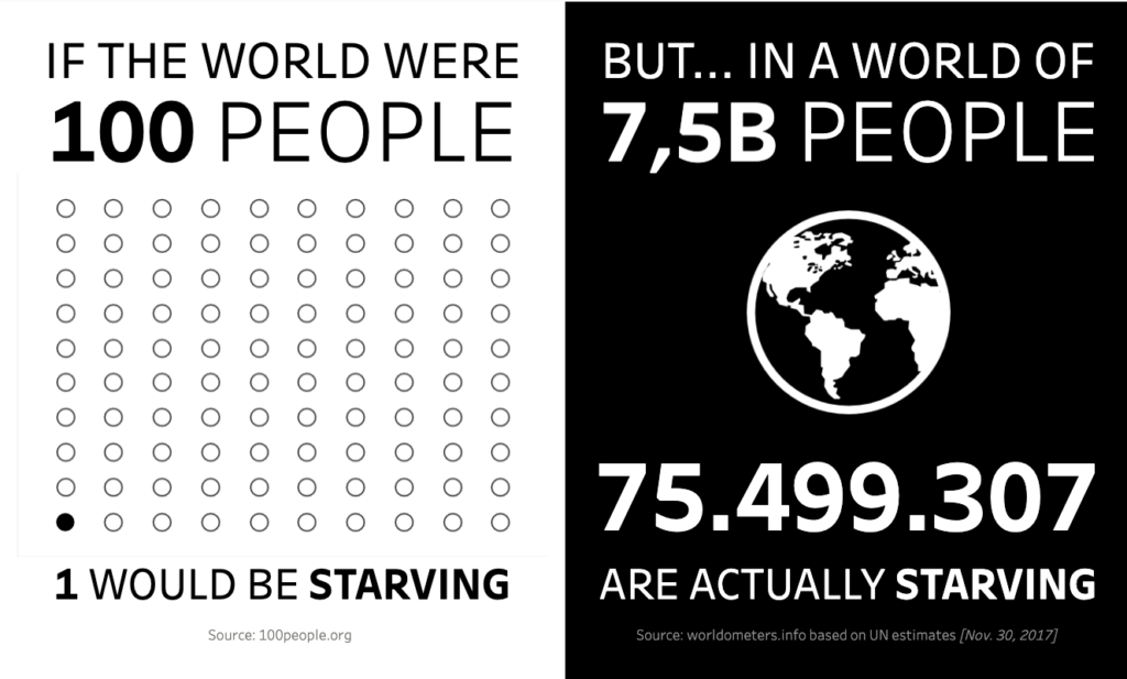
This is already an interesting step away from using percentages, to emphasize that there are people behind the numbers. Athan’s viz takes this a step further. He highlights his message through the contrast of the abstract number on the left, on a white background, and the translation of this into real terms on the right, on a dramatic black background. In addition, he has opted to display the full number, including all its 0’s, rather than showing it with the abbreviated M. His infographic reminds us that there is a balance between abstracting numbers to make them comprehensible and connecting with the reality behind them.
The Women Behind the Numbers
So, while we are eager to explore all the data we can find on obstetric fistula and gender inequality – in order to fight this injustice with as much evidence-based intervention as possible – we want to make sure that the individual tragedies aren’t forgotten in the bigger picture.
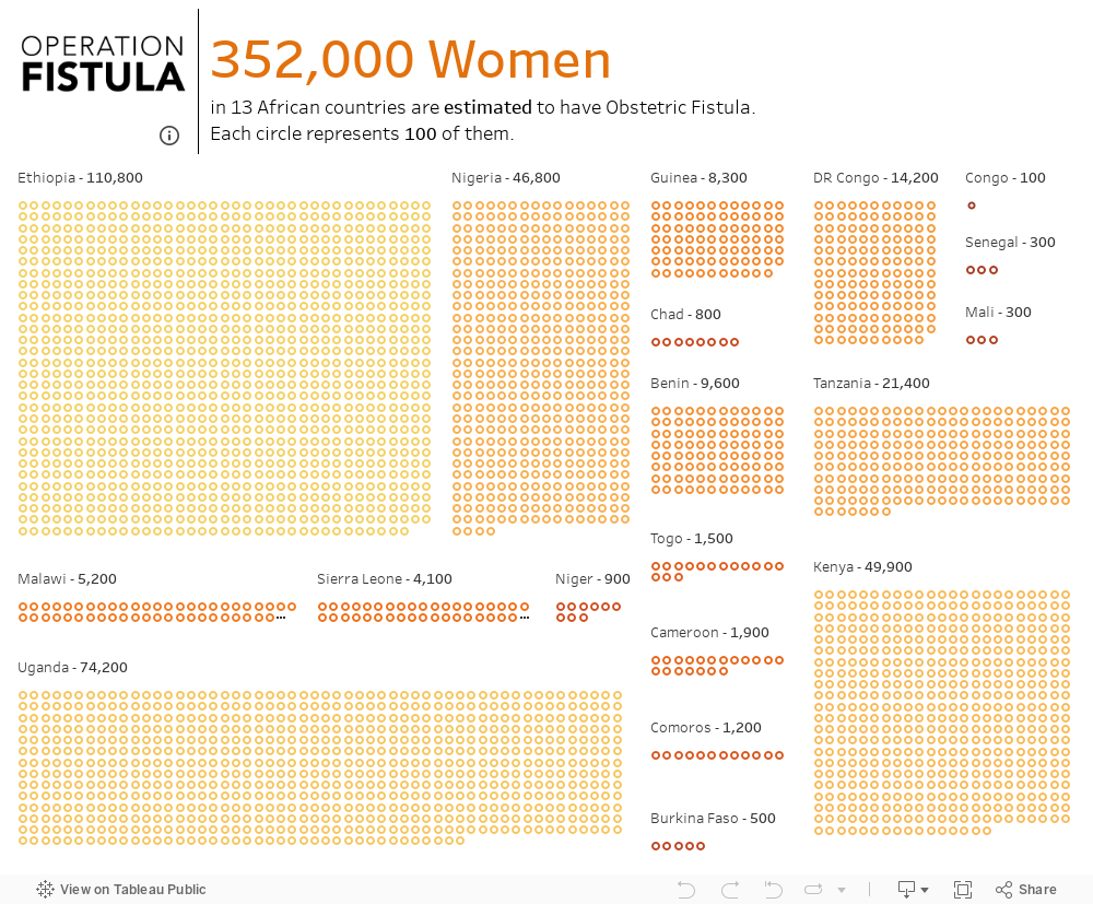
Numbers over a certain size are abstract to us. We have difficulty imagining or making sense of them. So after looking at the prevalence of obstetric fistula, I wanted to bring the women back into the foreground, to try to emphasize what these figures represent. I would have liked to show each woman estimated to suffer from fistula, but the number is too large to create a visualization. So instead, each dot on the dashboard below represents 100 women, who are thought to be affected by fistula. This is just an estimate, and only relates to 19 countries in sub-Saharan Africa. Considering the wide spread of countries across the world that have women with untreated fistula, the number will be much higher. But this can provide a starting point to try and get a sense of the number of women behind the numbers.